Brand
Brand
Guidelines.
Everything you need to represent Yukta Applications consistently — our logo, colors, typography, values, imagery, and voice. Use these guidelines across all brand touchpoints.
01
Welcome
Yukta (युक्ता) means appropriate, suitable, or joined in Sanskrit. We build what's actually needed — nothing more, nothing less. Every line of code serves a purpose.
Mission
Building technology that matters.
Yukta Applications is a Nepali SaaS and software product company in Biratnagar — building reliable, well-designed systems for education, hospitality, and business.
Vision
Trusted SaaS from Nepal, for the world.
To become the most trusted SaaS company in education technology starting from Nepal, scaling to the world.
Manifesto
"We believe software should be inevitable — so well-designed it feels like it was always meant to exist."
We start with education not because it's easy, but because it's the foundation of everything. The tools that shape learning shape society. We choose to build them with care.
02
Logo
Use the Yukta logo to represent our brand across all materials. We provide variations for different backgrounds and contexts.
Full logo on light
Use on white or light backgrounds.
Full logo on dark
Use on dark backgrounds (#141420 or darker).
Icon only
Only when the Yukta brand is clearly visible or established elsewhere.
Social card
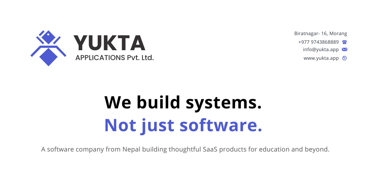
Open Graph image for social sharing (1200×630).
Clearspace
Maintain minimum clearspace equal to the height of the icon mark on all sides of the full logo.
Logo variations
Full color on light
Use the primary logo on white or light backgrounds.
White on dark
Use the white reversed logo on dark backgrounds (#141420 or darker).
Black on white
Use the monochrome black logo when color printing is limited.
Icon only
The diamond mark alone — only when the Yukta brand is already established in context.
Please do not
Do not rotate the logo.
Do not change the logo colors.
Do not add effects like drop shadows or outlines.
Do not stretch or distort the logo.
Do not place the logo on busy backgrounds without sufficient contrast.
Do not rearrange the logo elements.
Download assets


03
Typography
Our type system uses two complementary font families — Space Grotesk for headings and Inter for body text. This pairing balances personality with readability.
Heading Font
Space Grotesk
Yukta Applications
Building technology that matters
Education management reimagined
Section headings and card titles
Available weights
Aa Bb Cc 123
Aa Bb Cc 123
Aa Bb Cc 123
Aa Bb Cc 123
Type scale
The quick brown fox jumps over the lazy dog
Captions, overlines, small labels.
The quick brown fox jumps over the lazy dog
Button text, badge labels, table headers.
The quick brown fox jumps over the lazy dog
Sub-headings, card titles.
The quick brown fox jumps over the lazy dog
Section headings (h3–h6). Default heading size.
The quick brown fox jumps over the lazy dog
Major section headings (h2).
The quick brown fox jumps over the lazy dog
Page titles (h1) on desktop.
The quick brown fox jumps over the lazy dog
Large page titles (h1) on wide screens.
Body Font
Inter
Yukta Applications is a Nepali SaaS and software product company headquartered in Biratnagar, building industry-focused technology products for education and hospitality.
The name Yukta (युक्ता) means appropriate, suitable, or joined in Sanskrit. We build what's actually needed — nothing more, nothing less.
Available weights
Aa Bb Cc 123
Aa Bb Cc 123
Aa Bb Cc 123
Aa Bb Cc 123
Aa Bb Cc 123
Type scale
The quick brown fox jumps over the lazy dog
Captions, helper text, timestamps.
The quick brown fox jumps over the lazy dog
Small body text, meta information.
The quick brown fox jumps over the lazy dog
Default UI text, form inputs, buttons.
The quick brown fox jumps over the lazy dog
Body paragraphs, content descriptions.
The quick brown fox jumps over the lazy dog
Large body text, lead paragraphs.
04
Colors & Gradients
Our color system is built around a primary blue that works across every season and context. Click any swatch to copy its hex code.
Primary Brand Color
Blurple
#5865F2
HSL 234° 78% 58% · RGB 88, 101, 242 · Use for CTAs, links, active states, and key accents.
Light mode palette
Primary
#5865F2
The core brand blue. Use for primary buttons, links, active navigation states, focus rings, key accent elements, icons that need emphasis, and any UI element that represents the primary action on a screen.
Primary FG
#FFFFFF
White text placed on top of Primary (#5865F2) backgrounds. Use for button labels, active tab text, badge text on blue backgrounds, and any text that sits directly on the brand blue.
Background
#FFFFFF
The default page background for light mode. Use for the main canvas, page body, and any full-width surface that doesn't have its own background. This is the base layer everything sits on.
Foreground
#212130
Default body text color for light mode. Use for paragraphs, headings, list items, form labels, table data, and any text that reads directly on the Background (#FFFFFF). This is the primary reading color.
Card
#F6F6FA
Elevated surface background. Use for card components, modals, dropdown menus, popovers, sidebar panels, and any element that needs to visually lift off the page background. Slightly tinted to create depth.
Card FG
#212130
Text color for content inside cards. Same as Foreground — use for headings, paragraphs, and labels that sit on Card (#F6F6FA) surfaces.
Secondary
#EDEDF2
Subtle background for secondary UI elements. Use for tag backgrounds, badge fills, secondary buttons, code block backgrounds, highlighted rows in tables, and subtle section dividers.
Secondary FG
#42435A
Text on Secondary (#EDEDF2) backgrounds. Use for tag text, badge labels, secondary button text, and any text that sits on the subtle secondary surface. Slightly softer than Foreground.
Muted
#E8E8EE
Subtle fills for disabled or de-emphasized elements. Use for disabled button backgrounds, input field backgrounds, placeholder containers, progress bar tracks, and subtle horizontal dividers.
Muted FG
#6B6B82
De-emphasized text for secondary information. Use for timestamps, captions, helper text below form fields, placeholder text in inputs, metadata (read time, date), and any text that should be readable but not draw attention.
Accent
#5865F2
Interactive highlight color. Use for hover states on navigation links, selected dropdown items, active filter chips, toggle switch fills, and any element that needs a blue highlight on interaction.
Destructive
#E54D4D
Error and danger color. Use exclusively for error messages, delete confirmation buttons, destructive action warnings, form validation errors, critical alerts, and items that require caution. Never use for decorative purposes.
Border
#E0E0E8
Default border color for structural elements. Use for card outlines, input field borders, table row separators, horizontal rules, dropdown boundaries, and any element that needs a visible edge in light mode.
Dark mode palette
Background
#141420
The default page background for dark mode. Use for the main canvas, page body, and full-width surfaces. A deep navy-black that reduces eye strain in low-light environments.
Foreground
#F1F1FA
Default body text for dark mode. Use for paragraphs, headings, list items, form labels, and any text that reads directly on the dark Background (#141420). Slightly warm white to reduce glare.
Card
#1C1C2B
Elevated surface in dark mode. Use for card components, modals, dropdown menus, and panels that need to lift off the dark background. Subtly lighter than Background to create depth.
Card FG
#F1F1FA
Text on dark Card (#1C1C2B) surfaces. Use for headings, paragraphs, and labels inside dark cards. Same warmth as dark Foreground.
Secondary
#2E2E3A
Subtle background for secondary elements in dark mode. Use for tag backgrounds, badge fills, secondary buttons, code blocks, and highlighted table rows. Provides subtle contrast against Card.
Secondary FG
#D4D4E0
Text on dark Secondary (#2E2E3A) backgrounds. Use for tag text, badge labels, and secondary button text. Slightly muted compared to dark Foreground.
Muted
#2E2E3A
De-emphasized fills in dark mode. Use for disabled button backgrounds, input fields, placeholder containers, progress bar tracks, and subtle dividers. Same value as Secondary in dark mode.
Muted FG
#8B8BA0
Helper text in dark mode. Use for timestamps, captions, helper text, placeholder text, metadata, and any text that should be readable but not prominent. Softer than dark Foreground.
Border
#2E2E3A
Default border color in dark mode. Use for card outlines, input borders, table separators, horizontal rules, and dropdown boundaries. Subtle enough to define edges without being harsh.
Complementary colors
The primary blue (#5865F2) pairs naturally with warm whites (#FFFFFF, #F6F6FA) for backgrounds, deep navy (#212130) for text, and soft grays (#E8E8EE, #E0E0E8) for borders and muted elements. For contrast, the destructive red (#E54D4D) is reserved exclusively for error states.
Gradients
Primary Gradient
linear-gradient(135deg, #5865F2, #7B83F5)
Hero sections, primary CTAs, feature highlights.
Radial CTA
radial-gradient(ellipse at center, hsl(234 78% 58% / 0.15) 0%, transparent 70%)
Background glow behind call-to-action sections.
Text Gradient
linear-gradient(135deg, #5865F2, #8B93F8)
Gradient text for emphasis headings (use with bg-clip-text).
05
Brand Values
Six principles that guide every product, every feature, and every decision we make.
Customer-Centric
We start with the problem, not the solution. Every feature, every line of code, every design decision begins with understanding what our users actually need.
Thoughtful Design
Software should feel inevitable — so well-designed it was always meant to exist. We obsess over details because details are the product.
Continuous Improvement
Every project is a learning opportunity. We ship, we measure, we improve. Growth is not a phase — it is the process.
Transparency
Honest products come from honest teams. We communicate openly with our users, our partners, and each other. No hidden agendas.
Work-Life Harmony
We do not glorify burnout. We respect personal time, encourage breaks, and trust our team to manage their energy. Sustainable pace produces better work.
Global Perspective
Built in Nepal. Designed for the world. We solve problems closest to us first, then scale outward with the discipline of a global product.
06
Imagery & Photography
Our visual language is clean, modern, and warm — never sterile or corporate. Every image should feel intentional and authentic.
Photography style
Clean, modern, and warm — never sterile or corporate.
Natural lighting preferred. Soft, even lighting for workspace shots.
Nepal-contextual when possible — local architecture, landscapes, cultural elements.
Brand-tinted color treatment: subtle blue (#5865F2) accents in overlays or grading.
Diverse team representation in all people photography.
Workspace
Clean desks, modern laptops, collaborative spaces, whiteboards with diagrams.
Team
Real team members working, pair programming, design reviews, casual conversations.
Nepal
Biratnagar cityscape, Koshi Province landscapes, local architecture, Nepal flag.
Product
YEDU and YAFE UI screenshots, dashboards, feature highlights on devices.
Avoid
Generic stock photos of handshakes, lightbulbs, or chess pieces.
Over-filtered or heavily saturated images.
Images that imply exclusion or elitism.
Low-resolution or pixelated imagery.
Stock photos with visible watermarks or dated styles.
07
Brand Voice & Tone
How we communicate defines how people experience our brand. Every word earns its place.
Confident
We know what we build and why. We state things clearly without hedging.
Clear
No jargon for the sake of jargon. If a simpler word works, use it.
Warm
Professional does not mean cold. We write like humans talking to humans.
Purposeful
Every word earns its place. We do not pad copy with filler or fluff.
Writing rules
Use active voice. "We built YEDU" not "YEDU was built by us."
Keep sentences short. If a sentence runs past 25 words, split it.
Avoid buzzwords: leverage, synergize, disrupt, pivot, scale, ecosystem.
Use specific numbers. "3,000+ students" not "thousands of students."
Refer to Nepal and Biratnagar with pride, not apology.
Product names are always capitalized: YEDU, YAFE, Yukta.
Example copy
Product description
YEDU brings student information, academics, attendance, examination, finance, and communication into one platform — built for how schools actually work in Nepal.
Social post
3,000+ students now manage their academic journey through YEDU. Built in Biratnagar, trusted by schools across Nepal. 🇳🇵
Error message
Something went wrong while saving. Your changes have not been lost — try again or contact support if this continues.
08
Do's and Don'ts
Quick reference for correct and incorrect usage of our brand elements across all touchpoints.
logo
Do
- Use the logo as provided in the asset package.
- Maintain minimum clearspace around the logo.
- Use white logo on dark backgrounds.
- Use color logo on white or light backgrounds.
Don't
- Do not stretch, skew, or rotate the logo.
- Do not change the logo colors or apply gradients.
- Do not add outlines, shadows, or effects.
- Do not place the logo on low-contrast backgrounds.
color
Do
- Use the approved brand palette from this guide.
- Use primary blue (#5865F2) for key actions and emphasis.
- Ensure sufficient contrast for accessibility (WCAG AA minimum).
- Use muted tones for secondary and background elements.
Don't
- Do not introduce unapproved colors into brand materials.
- Do not use primary blue as a background for large areas.
- Do not place light text on light backgrounds.
- Do not use destructive red for non-error states.
typography
Do
- Use Space Grotesk for all headings and display text.
- Use Inter for body text, paragraphs, and UI elements.
- Maintain consistent type scale across all materials.
- Use font-bold (700) for headings, font-regular (400) for body.
Don't
- Do not substitute fonts without approval.
- Do not use more than two font families in a single layout.
- Do not use decorative or handwritten fonts for brand materials.
- Do not set body text below 14px for readable content.
imagery
Do
- Use high-quality, original photography when possible.
- Apply consistent brand-tinted color treatment.
- Show real team members and real workspaces.
- Include Nepal-contextual elements where relevant.
Don't
- Do not use generic stock photography.
- Do not over-filter or heavily saturate images.
- Do not use images that exclude or stereotype.
- Do not use low-resolution or pixelated images.
Legal
Brand asset usage
All trademarks, logos, trade dress, and brand materials (the "Brand Assets") are the exclusive property of Yukta Applications Pvt. Ltd. You must have permission from Yukta before using any Brand Assets except as permitted in these guidelines.
You may use the Yukta logo and icon to refer to Yukta Applications in articles, profiles, and partner pages. Do not alter or restyle them, and do not imply endorsement unless agreed.
These brand guidelines may be updated at any time. Continued use of Brand Assets after changes constitutes acceptance of the updated guidelines.
Questions about brand usage?
Contact us for approvals, custom asset requests, or clarification on these guidelines.
info@yukta.app